The Importance of Responsive Web Design
Did you know that the Responsive Web Design Is it key to the success of your online business? In today's digital age, it's essential that your website adapts to different devices, whether it's desktop, tablet, or mobile. Responsive web design ensures an optimal user experience no matter the device used, allowing you to reach a wider audience and increase your conversions.
Imagine this: A potential customer visits your website from their mobile phone and has a hard time navigating and finding the information they need. Do you think he's likely to stick around and make a purchase? Probably not. But if your website is designed with responsive design, it will automatically adapt to your device's screen size, giving you a smooth and enjoyable user experience.
Don't underestimate the impact that responsive web design can have on the growth of your online business. With a mobile-friendly website, you'll not only improve the user experience, but you'll also increase search engine visibility and stand out from your competition.
In this article, we'll explore the importance of responsive web design and how you can leverage it to maximize the success of your online business. Read on to find out more!
What is responsive web design
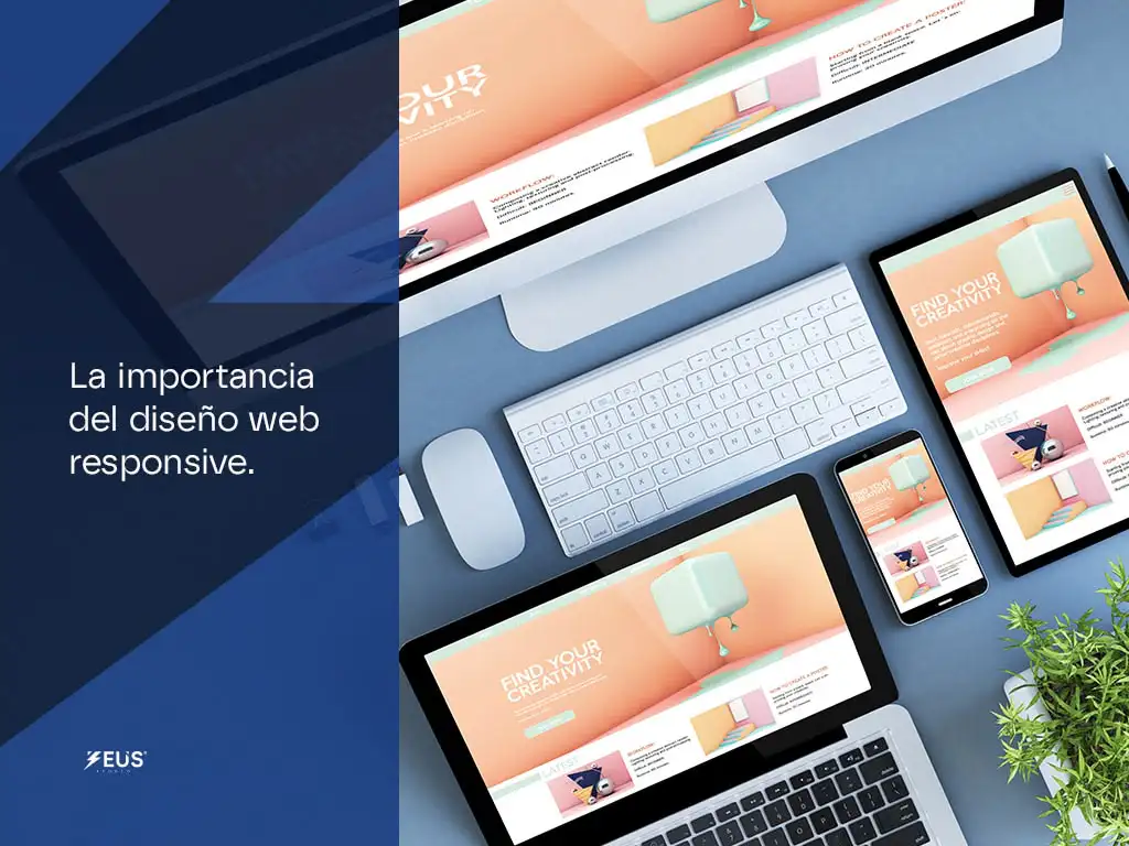
Responsive web design is a design and development technique that seeks to automatically adapt a website's design to different devices and screen sizes. This is achieved by using technologies such as CSS, media queries, and flexible layouts. Simply put, a website with responsive web design will look and function optimally, regardless of the device used to access it.
The main goal of responsive web design is to provide a consistent and quality user experience across all devices. Instead of having different versions of a website for each type of device, responsive web design allows a single website to adapt and look good on any screen.
Responsive web design not only applies to the visual appearance of a website, but also to its functionality. This means that interactive elements such as buttons and forms must also be adapted and easy to use on mobile devices.
In short, responsive web design is an essential practice for any online business that wants to provide an optimal user experience across all devices and maximize their online success.
Advantages of responsive web design
Responsive web design offers a wide range of advantages for both website owners and users. Here are some of the most important advantages of responsive web design:
- Improve user experience : Responsive web design ensures that users have an optimal experience when browsing your website, regardless of the device they use. This means that they will be able to access your content easily and quickly, without having to zoom or scroll horizontally.
- Increase search engine visibility : Search engines, such as Google, prefer websites with responsive web design. By having a responsive website, you'll increase your chances of appearing in search results and improve your online visibility.
- Save time and money : Instead of having to develop and maintain multiple versions of a website for different devices, responsive web design allows you to have a single website that adapts to all screens. This will save you time and money in developing and maintaining your website.
- Improve conversion rate : By providing an optimal user experience, responsive web design can help increase your conversion rate. Users will be more likely to make a purchase or fill out a form if they have a smooth and enjoyable experience on your website.
- Stand out from the competition : As more users access the internet from mobile devices, having a responsive website will help you stand out from your competition. By offering a superior user experience, you can capture users' attention and gain their trust.
These advantages show the importance of responsive web design for the success of your online business. Now let's look at some statistics that support this claim.
Statistics on Responsive Web Design
Statistics clearly demonstrate the importance of responsive web design in today's internet landscape. Below are some relevant statistics:
- According to a report by Statista, the number of mobile phone users worldwide is estimated to reach 7.26 billion by 2021. This means that more people will access the internet from mobile devices, highlighting the need to have a responsive website.
- According to Google, 53% of users will abandon a website if it takes more than 3 seconds to load on a mobile device. This shows the importance of having a mobile-friendly website that loads quickly.
- A study conducted by Adobe found that 39% of users will stop interacting with a website if images don't load or take too long to load. Responsive web design can help optimize image loading and improve the user experience.
These statistics highlight the need to have a responsive website to ensure an optimal user experience and maximize the success of your online business. Now let's take a closer look at why responsive web design is so important for your business.
Importance of responsive web design for the success of your online business
Responsive web design is essential to the success of your online business for several fundamental reasons:
- Improve user experience : As mentioned earlier, responsive web design ensures that users have an optimal experience when browsing your website. This is especially important on mobile devices, where navigation can be more difficult. If users have a positive experience on your website, they're more likely to become loyal customers and make repeat purchases.
- Increases search engine visibility (SEO) : Search engines, such as Google, value responsive web design and take it into account when ranking websites in search results. By having a responsive website, you'll increase your chances of appearing at the top of search results, giving you greater visibility and driving more traffic to your website.
- Reach a wider audience : With the rise of mobile devices, more and more people are accessing the internet from their phones and tablets. If your website isn't optimized for mobile devices, you're missing out on a huge opportunity to reach this growing audience. Responsive web design allows you to reach a wider audience and maximize your chances of converting visitors into customers.
- Build trust and credibility : A responsive website shows that you care about your users' experience and are committed to providing them with quality service. This builds trust and credibility in your brand, which can influence users' decision to make a purchase or hire your services.
- Stand out from the competition : Although responsive web design has become more common in recent years, there are still many websites that are not optimized for mobile devices. By having a responsive website, you'll stand out from your competition and show that you're at the forefront of the latest trends in web design.
These are just a few of the reasons why responsive web design is so important to the success of your online business. Now let's look at some key features of responsive web design.
You may be interested in: What is web design
Key Features of Responsive Web Design
Responsive web design relies on several key features that allow a website to adapt to different devices and screen sizes. Here are some of the most important features of responsive web design:
- Fluid design : Fluid design is a key feature of responsive web design. This means that website elements such as images and text automatically adjust to the screen size without losing their readability or functionality.
- Adaptive Imaging : Adaptive images are images that automatically adjust to the size of the screen. This ensures that the images look good on any device and don't slow down page loading.
- Intuitive navigation : Navigation on a responsive website should be intuitive and easy to use on mobile devices. This involves the use of drop-down menus, large buttons, and a layout that adapts to the way users interact with their mobile devices.
- Fast charging time : A responsive website should load quickly on any device. Mobile users have little patience and expect pages to load quickly. Optimizing your website's load time is critical to providing a satisfactory user experience.
These key features of responsive web design ensure an optimal user experience on all devices and maximize the chances of success for your online business. Now let's look at how you can create a responsive website.
How to Create a Responsive Website
Creating a responsive website requires some technical knowledge and design skills, but it's not an impossible task. Here are some key steps to creating a responsive website:
- Use a responsive design framework : Responsive design frameworks, such as Bootstrap or Foundation, provide a solid foundation for creating a responsive website. These frameworks offer a wide range of predefined components and styles that you can use on your website.
- Use CSS media queries : CSS media queries are a key technique for creating a responsive website. These queries allow you to apply different styles depending on the size of the device's screen. For example, you can define specific CSS rules for mobile devices or tablets.
- Design with a mobile-first approach : When designing your website, it's important to take a mobile-first approach. This means that you should design and develop your website with the limitations of mobile devices in mind, and then add additional features for larger devices.
- Test on different devices : It's critical to test your website on different devices to make sure it looks and works well on each device. You can use device emulation tools or simply ask friends or colleagues to test your website on their devices.
These are just a few of the key steps in creating a responsive website. If you don't have a background in web design or prefer to leave it to professionals, you can also consider hiring an agency that specializes in responsive web design.
Responsive Web Design Best Practices
In addition to the steps to create a responsive website, there are some best practices you should follow to ensure quality responsive web design. Here are some of the most important best practices:
- Optimize images : Images can slow down your website's loading, especially on mobile devices. It's important to optimize images so that they load quickly without losing quality. You can use tools like TinyPNG or JPEGmini to compress your images without losing quality.
- Make text readable : The text on your website should be readable on all devices. Make sure your font size and spacing are mobile-friendly, and avoid using fonts that are too small or complex text styles that can make it difficult to read on small screens.
- Simplify navigation : Navigation on a responsive website should be simple and easy to use on mobile devices. Use drop-down menus, clear icons, and an intuitive design so users can easily access the content they want.
- Prioritize important content : On mobile devices, screen space is limited. It's important to prioritize the most important content and make sure it's easily accessible on mobile devices. This involves placing key elements at the top of the page and using a layout that highlights relevant information.
These best practices will help you ensure quality responsive web design and provide an optimal user experience across all devices. Now let's look at some useful tools and resources for responsive web design.
Responsive Web Design Agencies
If you don't have the technical know-how or time to create a responsive website on your own, you may want to consider hiring one Agency specialized in responsive web design . These agencies have trained professionals who can create a quality responsive website that suits your business needs and goals.
When choosing a responsive web design agency, be sure to research their experience and review their portfolio of past work. Look for agencies that have experience in your industry and can provide you with references or testimonials from satisfied clients.
Additionally, it is important to establish clear communication with the agency and discuss your expectations and requirements. Make sure the agency understands your business goals and can offer you customized solutions for your responsive website.
Hiring a responsive web design agency can save you time and ensure a quality website that meets responsive web design best practices.
Conclusion
In short, responsive web design is essential to the success of your online business. With a responsive website, you'll improve the user experience, increase your search engine visibility, and stand out from your competition. In addition, responsive web design allows you to reach a wider audience and maximize your conversions.
Responsive web design is based on key features, such as fluid design and responsive images, and can be achieved using responsive design frameworks and CSS media queries. There are also helpful tools and resources to help you create a quality responsive website.
If you don't have the technical knowledge or time to create a responsive website on your own, you may want to consider hiring an agency that specializes in responsive web design. These agencies have trained professionals who can create a custom responsive website that suits your business needs and goals.
All in all, investing in responsive web design is a smart move that will allow you to maximize the success of your online business and provide an optimal user experience across all devices. Don't underestimate the power of responsive web design and start taking advantage of it today!