Responsive web design, also known as responsive design, has become a must-have standard to ensure an optimal user experience and improve your site's visibility in search engines.
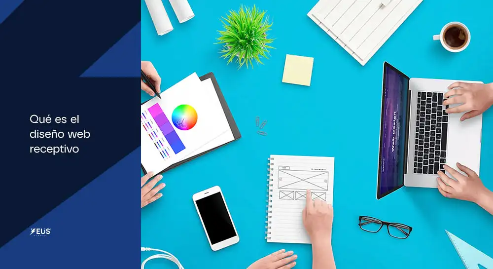
What is responsive web design?
Responsive web design is a web development approach that allows a site to automatically adapt to the user's screen size and device, whether it's a mobile phone, tablet, desktop, or even a smart TV. This type of design uses techniques such as:
- Media queries : They allow the site to adjust its layout according to the dimensions of the screen.
- Flexible designs (flexbox and grid) : Ensure that website elements are distributed and aligned correctly.
- Scalable images and fonts : They adapt without losing quality or legibility.
In short, responsive web design ensures that your website is functional and attractive, no matter how users access it.
Why is responsive web design important?
Better user experience (UX)
A responsive site provides smooth and consistent navigation across devices. Users can find information quickly and without frustration, which increases the likelihood that they will stay longer on your site.
Improve SEO positioning
Google prioritizes websites with responsive design in its search results. By offering a quality mobile experience, you improve your search engine rankings, increasing the visibility of your site. You can read more about it here: What is SEO and what is it for?
Increase conversions
A streamlined design makes it easy to take key actions, such as filling out forms, making purchases, or contacting your business. Users are more likely to become customers if they have a positive experience.
Time and cost savings
A responsive site eliminates the need to develop and maintain different versions for mobile and desktop, reducing costs in the long run.
You may be interested in: How SEO and web design interact for better results
Main Elements of a Responsive Web Design
Media Inquiries
Media queries allow your site to detect screen size and apply specific styles. For example, you can adjust the size of fonts or rearrange content according to the user's device.
Flexible designs
Using tools like CSS Grid and Flexbox helps create flexible structures that adapt automatically. This is crucial to maintaining a consistent viewing experience.
Adaptive Imaging
Images should automatically snap to the container that contains them without losing quality. In addition, it is important to optimize them for the web, making sure that they do not slow down the loading time.
Scalable typography
Using relative units such as "em" or "%" ensures that fonts fit the screen size correctly, improving readability.
How to implement responsive web design?
- Planning and structure : Defines what content is prioritized and how it will be displayed on different devices.
- Using Frameworks : Tools such as Bootstrap or Foundation make it easy to create responsive layouts thanks to their predefined grid systems.
- Constant testing : Use tools like Google Mobile-Friendly Test to verify that your site is fully responsive.
- Speed Optimization : Compress images, minimize code, and uses a fast hosting service to ensure fast load times.
What is responsive web design. Conclusion
Responsive web design isn't just a trend, it's a necessity. In Zeus Studio , we specialize in creating Websites that not only look amazing, but are also optimized to deliver results. If you're looking to improve your users' experience and increase your online presence, Contact us today!